|
|
| Jack Kirby Collector celebrates the life and career of the "King" of comics through interviews with Kirby and his contemporaries, feature articles, and rare & unseen Kirby artwork. Now in tabloid format, the magazine showcases Kirby's art at even larger size. |
The Kirby Squiggle & The Evolution Of His Styleby and © Link Yaco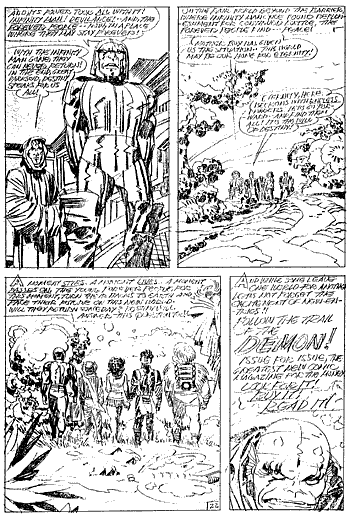 Uninked pencils to the final page of Forever People #11, full of Kirby squiggles and psychedelia. Forever People © DC Comics. Art © Jack Kirby. How did the slam-bang illustrator of Captain America get to the point where his figures lacked any recognizable human muscle structure and seemed to be built almost entirely of geometric shapes (especially in the case of the Thing)? To trace the evolution of Kirby's style, it is helpful to make some arbitrary divisions. Although Kirby's development was continuous and there were no quantum leaps in style (although his final stylistic change is abrupt), let us consider his work in designated stylistic periods. Early Kirby (1935-39) Kirby worked in a number of different styles but by the time he gets to Wilton of The West, some of the distinctive features of later Kirby are already in evidence: Curved legs, leaping figures, and recognizable Kirby faces, especially the noses. Feathered shading is far more in evidence and at times a Raymond-like influence seems apparent. Early Simon & Kirby (1940-45) The Early style is codified here and the distilled result is singularly Kirby, owing no debt to any influence, although a significant amount of feathering remains. It is interesting to note some of the imaginary creatures Kirby invented at the end of this period and the beginning of the next (especially for his early Harvey period, in 1945): fully-visualized killer apes, giant insects, dinosaurs, and wholly-invented monsters. Late Simon & Kirby (1946-55) Feathering disappears almost altogether. Kirby adopts a thick wiggly line, the precursor of the more attenuated '60s squiggle. Textures on rocks and clothing become heavier and more abstract. Rocks, in particular, become abstract designs, almost pure exercises in form. Figures start to thicken. The skinny adolescent figure of his Captain America work is replaced by the more adult heftiness of his Fighting American. This might have been a reflection of his own physical maturity. Post-Code (1955-1963) After the Comics Code struck, the great homogenization of comics began. The bland, undistinctive, unthreatening, and unexciting DC house style, as epitomized by Curt Swan (no reflection on the ability of that talented artist, who actually rose above the limitations of the house style, even as he established it), set the standard of the day. When artists such as Frazetta tried to work for comics, they were told their style was "old-fashioned." John Severin was told that he didn't know how to draw war comics. It might be that Kirby lost some confidence in that period. His work for DC looks more mainstream, less dynamic, and much toned-down. Even his monster work for Marvel looks safe as milk. The monsters look like globs of modeling clay-pikers compared to the creatures he used to produce with Joe Simon. And when he finally gets to do his own super-hero series again, Fantastic Four, the figures are insubstantial, weakly rendered, and the work lacks detail. Coincidentally, as Kirby's career waned, the careers of abstract modernist painters bloomed. The New York Expressionists, notably Jackson Pollack, become the object of much media attention, and Picasso and his Cubist buddies start to get mass market acceptance. Soon nearly every respectable middle class living room in America has a Picasso print. Perhaps while Kirby was struggling to make a living, some part of him envied these academic poseurs for making a fortune dripping squiggles of paint and reducing the human form to geometric shapes. Super-Heroes (1963-65) Within a year, Kirby seems to regain his confidence. His figures get heavier, his settings gain so much detail that his machinery becomes a hallmark of his style, and his musculature becomes robust and complicated. His machinery, like his rocks, becomes a study in abstract composition. Artsy (1965-On) And suddenly, Kirby blossomed. Maybe it was getting some recognition after the struggles of the Post-Code years. Maybe it was the zeitgeist, the spirit of the times. Traditional feathering became antithetical to the Kirby style. It was always those abstract squiggles. His musculature, machinery, rocks, and just about everything became wild textural exercises. Whether he drew images of outer space, microscopic space, the Negative Zone, sci-fi cities, or futuristic machinery complexes, the result was always a controlled explosion of form and color. No wonder the long-hairs nodded knowingly and snickered. The culture of psychedelia in the mid-to-late Sixties might have been the final influence that crystallized the Kirby style. If you're old enough to remember campus life from that period, you know that Kirby's adventures into the Negative Zone and Asgard - as well as, and especially Ditko's Dr. Strange - were regarded as psychedelic. Both Kirby and Ditko - and later, following their lead, Steranko and Adams - utilized abstract geometric forms that gave comics a new, artsy, and sophisticated graphic identity. When Kirby introduced the Inhumans, it was the first time that super-heroes had costumes that were entirely design-oriented. Unlike Superman's "S," the Flash's lightning bolt, or the Fantastic Four's four, those design lines on Black Bolt's chest were entirely non-functional and non-representational. They were just there because they looked good! Kirby definitely did not deliberately set out to echo the wild shapes and colors of San Francisco concert posters, and the idea of ideologically reactionary Steve Ditko doing anything to endorse the emerging "counter-culture" is absurd, but the resemblance is striking. The idea was in the air, and everyone was somehow influenced by the psychedelic style of the times. Perhaps it was the final catalyst for Kirby and freed him from the constraints of strictly representational work. Not that he had ever been terribly constrained, but his final stylistic jump took him to a design level no other mainstream comic artist has reached before... or since!  Sign up here to receive periodic updates about what's going on in the world of TwoMorrows Publishing. |