|
|
| Comic Book Artist, Eisner Award winner for "Best Comics-Related Magazine", celebrates the lives and works of great cartoonists, writers and editors from all eras through in-depth interviews, feature articles, and unpublished art. |
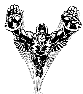
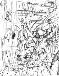
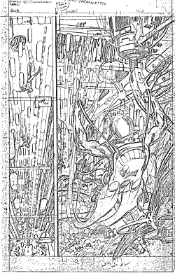
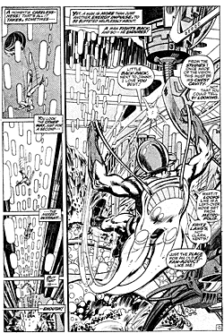
Neal and Tom's splash page image from Amazing Adventures #5. Black Bolt ©1998 Marvel Entertainment. The Art of Inking Neal Adamsby & © Tom PalmerFrom Comic Book Artist #3 I remember the first time I had seen Neal's work—Roy Thomas had bought a half-page of "Deadman" [Strange Adventures #212, pg. 8] and had it framed, and it was quite different from other comic book artwork that I had seen up to that point. I was young, but I had seen Kirby's stuff, I had seen Buscema's stuff, it was all very good—I mean, just fantastic—but there was something else, there was a maturity to Neal's work that was so much different. He should've been older than all of them to have that maturity; it was natural, almost a gift. By going to Johnstone & Cushing—that was the spot line-drawing studio of the city—and meeting Lou Fine, and Stan Drake, and all those people, Neal, at a very young age, was brought up the right way, he got the right input, and it served him well. Even without that schooling, he still would've achieved 95% of what he has. It is irrefutable when you see Neal's work, that he is an exception. And he was then. The first issue of the X-Men is what I remember the most vividly. The first three to five pages, with the Sphinx in the background, the rocket car—I would just sit back and marvel at these beautiful renderings. In Neal's second issue with the shot of King Faisal, where he's pointing—you can see Neal used a photo—I was just taken aback by the rendering of that pencil drawing. It's easy for me to describe from my eyes or my memory of that time, but to sit there and look at that stuff—I don't mean to make this sound too much like a religious experience, but it was whatever would be close to that.
I'm sure other pencils have impressed me over the years when they've come across my drawing board, but maybe because Neal's were the first, they left such an impression that it still lingers today. It's like your first love—you always remember it. It really caught me between the eyes, the way it caught everyone else who saw those books, and it affected me the same way. Neal influenced a whole generation of artists—myself included—just as Milton Caniff did years prior. Neal's ability—it was not so much the realism as the way he handled the pencil. I saw him penciling once, and he didn't hold it as if you were writing with it, nor did he take the broad side of a pencil, so everything had a broad side. He held it at an angle, he turned it—not in a very mannered way, but as if he were sketching something, so the lines were not stroked as evenly-thick pencil strokes. I remember the line getting thinner and thicker, this pencil line that kind of undulated between the two; it ebbed and flowed as if it was a drawing done as a rendering. I've seen people try to pencil like Neal, but you could tell immediately it's all bogus, because they never had that line. He was the natural, he was the one they were all trying continued on the next page continued from the previous page to copy. Other guys today try to pencil as if they were going to ink it, or they're trying to set it up for the inker. Neal penciled for penciling; the inking became another art that you brought to it. And I think that's what I was challenged by. He didn't put a line down that you just filled in. You didn't trace it—you had to bring something to it. As far as inking over Neal, you realized you couldn't do it all in pen, nor could you do it just in brush—you needed both if you wanted to pick up what he was doing when he inked. He would probably render in pen, and then go back with a brush, and hit some of the heavier lines, and also some of the shadowing. You could tell, because it was a real juicy black line; it kind of forced me to match it. I remember taking a day or more to ink one page—not every page, but certain pages. It wasn't something that you knocked out in a couple of days. Not that I was doing that with Dr. Strange with Gene Colan, and that's what I had gained some favor for. Maybe it was because of my youth, or the "golly-gee-whiz" point of my life—but I slowed down and put every ounce of whatever skill I had at that moment. I may have worked too hard on those X-Men issues—I may have stiffened up some of the fluid lines that Neal had done. The first pages of that "Fantastic Voyage" issue [#93] just blew me away. Neal just amazed me with what was going on. There were some shots in there, some of the scenes—it was all so original. I remember spending a lot of time on that issue—and coloring it also. I don't know if we traded coloring assignments, but I remember Neal felt confident about that. There was a satisfaction, I think, for both of us—that issue may have been the high point of it all. At least I remember being very proud it. In a way, I thought that the Avengers was my better work. When we got into that series, I think I had matured a little bit, plus I felt a little bit more at ease with Neal's pencils. And I think Neal was more comfortable going in, too. Over the years I've come to realize, working with different people, you can tell when someone is interested or excited about the story. The Avengers was something Neal was really looking forward to. It's something I've always remembered; I kind of hold it up as the criteria to whatever I'm working on. Not to say no one ever reached that criteria, but in a different way. I've worked with some talented people, and I have respect for anybody in the business. Working with Neal was always fun, I always looked forward to it, and it helped me grow a little bit; each job helped me grow because it challenged me. And I know it did Roy; Roy was just on a cloud—he just loved it. Whether it was the writer, the colorist, the inker, or even the letterer, working on Neal's stuff brought out the best in anyone. To make subscription and back issue orders easier for our readers (especially those overseas), we now accept VISA and MASTERCARD on our secure web store! (Phone, fax, mail and e-mail accepted, too!)  Sign up here to receive periodic updates about what's going on in the world of TwoMorrows Publishing. |